
The Challenge
The general goal of this design was to create a two-sided e-commerce platform matching a millennial target audience to local home improvement professionals.
The marketplace for such platforms is a crowded one, with bigger and more established competitors. Consequently, the secondary challenge was to find opportunities where Renova could stand out in a way that promoted increased user engagement across devices. For the five-week project, the team focused on the consumer half of the platform.
I focused on developing a UX strategy aimed at 1) enhancing the quality of matches made between the end-user and contractor, and 2) designing the right solutions for the right problems in order to execute stakeholder goals.
Discovery
The team took a two-pronged approach: 1) assess current market conditions, and 2) determine how millennials (the identified target audience) currently engage with other home service platforms already in operation.
Domain Research
While millennials represented only 14 percent of American homeowners, 84 percent of them reported intending to stay in their homes for a decade or longer, indicating that professional hires are relevant to this demographic. Further, the types of homes millennials are purchasing are “often older homes that need more repairs.” And with 87 percent of all home projects resulting in hiring a professional, it was clear to the team that Renova could be an impactful way to meet consumer needs.
Even though competitive analysis revealed bigger, more established companies taking up an already crowded marketplace, there were noticeable entry points for RENOVA to shine. Specifically, increasing transparency about the process and professionals, providing more information for users to be more successful at resolving their needs, and decreasing repetitive work for the user were areas that RENOVA could stand out amongst the crowd.
Exploratory Research
Domain research showed millennial habits within the space do not mimic other generational cohorts, so employing a survey and conducting qualitative interviews was critical to getting direct target audience insights to guide UX strategy. There were strong patterns across both testing methods to shape our understanding of, and strategy for, the user experience.
User Interviews

100%
Users consider price as the biggest factor in their decision to pursue projects and hire professionals.
90%
Users who reported a lack of information available to them as a frustration.
70%
Users reported needing transparency in the process, including price, contractor skill, and time to completion.
Survey
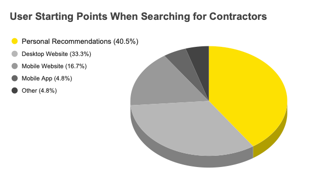
A survey was created and posted to various sites, specifically targeting pages related to home improvement projects, renovations, and similar content. While survey data from 42 participants echoed many of the qualitative findings from user interviews related to price and contractor quality, additional data showed where users would go first to begin searching for professionals:
Insights
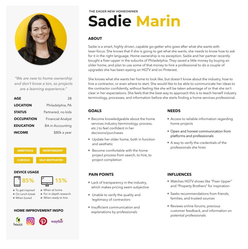
Results from preliminary research made it clear that a desktop design needed to not only offer useful features, but take it a step further to embody and deliver the digital equivalent of a personal recommendation. If we were going to make a personal recommendation, we would need, well, a persona to ground our goals.
Meet Sadie
The price-conscious homeowner needs a simple, direct way to find relevant contractors because the right hire can minimize costs and frustrations.

Solutions
To further foster empathy for and understanding of users’ larger contexts, while also considering business constraints and applicability of design solutions, the team utilized mind mapping and brainwriting techniques to rapidly and broadly generate design solutions.

Mind mapping was selected in order to better capture and comprehend user thinking, helping make RENOVA’s design more aligned with and natural to users’ thinking and cognitive processes.
Brainwriting helped the team rapidly generate divergent ideas in a collaborative way. This exercise was an efficient way to brainstorm equitably and begin concepting those ideas on paper.

Concepts
During divergent concepting, I focused on two solutions to contribute to the design: a price estimator and glossary.
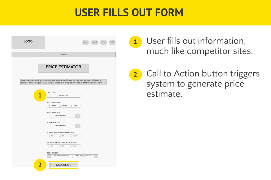
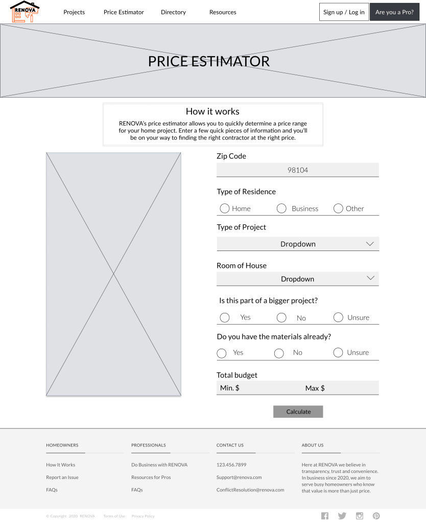
Price Estimator
The initial concept was a budget tracker, in which a user can keep a close eye on the money being spent on a home project as it progresses. From feedback, it was determined that while a budget tracker could be moderately useful and original, a price tool earlier in the user’s hiring journey would be more appropriate based on the data obtained during our initial research efforts.
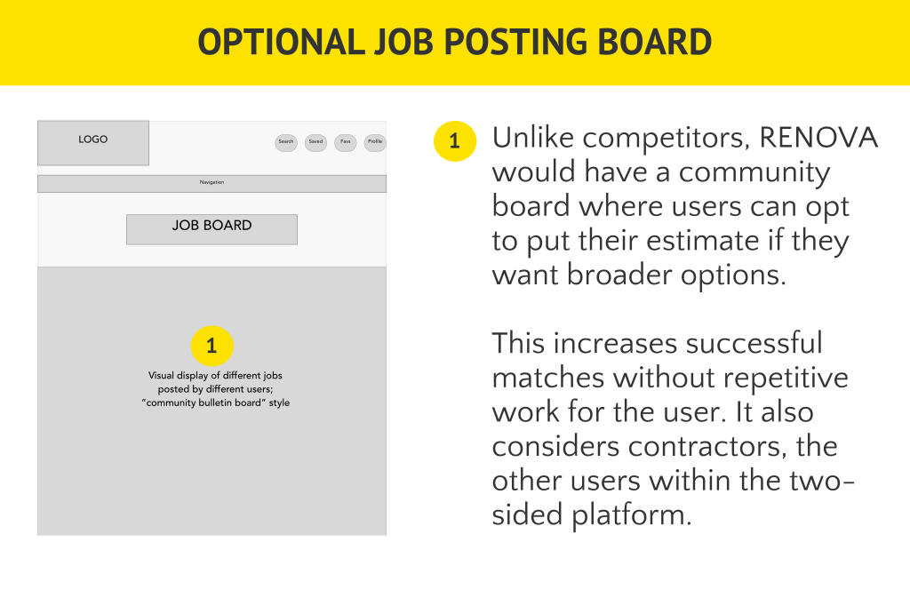
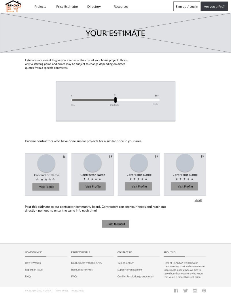
Price estimate tools are ubiquitous amongst competitors, so to add value to RENOVA’s design, I incorporated a community job board, where contractors that might not have otherwise surfaced can compete for the project. This expands the users’ ability to find the right hire with a click of a button. This intervention also remembers that the platform is two-sided, and can incorporate a more traditional bidding method found in the industry.

Glossary
The other user frustration I wanted to tackle was the lack of industry knowledge, creating barriers to understanding, clarity, and confidence of users when hiring for projects. While not a stand-alone concept, a glossary lets the user approach communication more confidently, and it gives them better parameters around which to frame their project. When the user can share language with professionals, the understanding (and by extension the user experience) is enhanced.
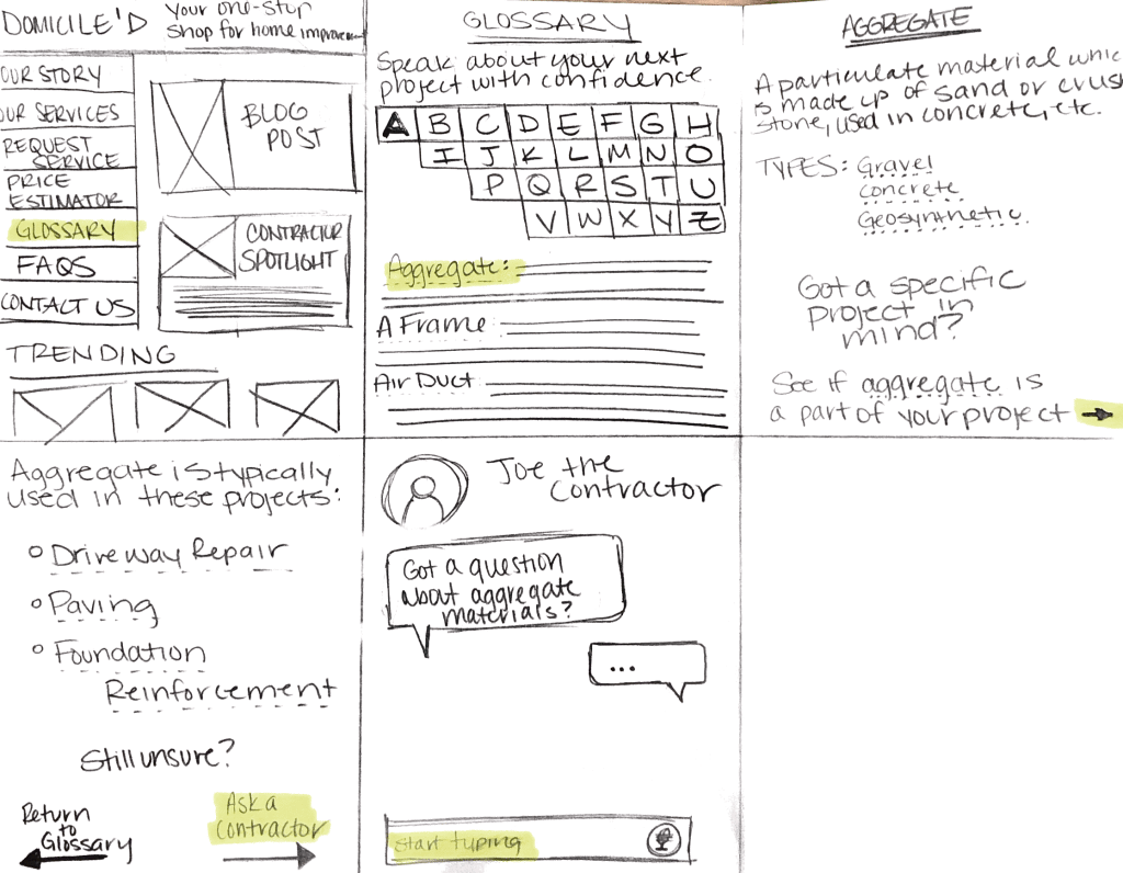
A glossary of key industry terms helps users feel empowered when communicating with contractors.
While this concept was not prioritized and included in the final design for RENOVA during the team’s convergence strategizing, it is a feature that may be valuable to add in later iterations of the design.
Convergence
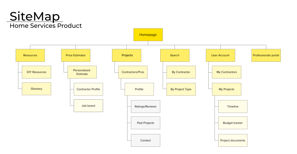
Continuing to converge and refine concepts, the team made a site map to clarify flow throughout the platform and guide wireframe building.
Mid-Fidelity Wireframes

The first round of wireframes focused on three main flows:
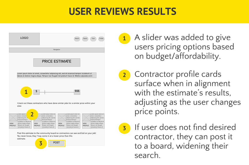
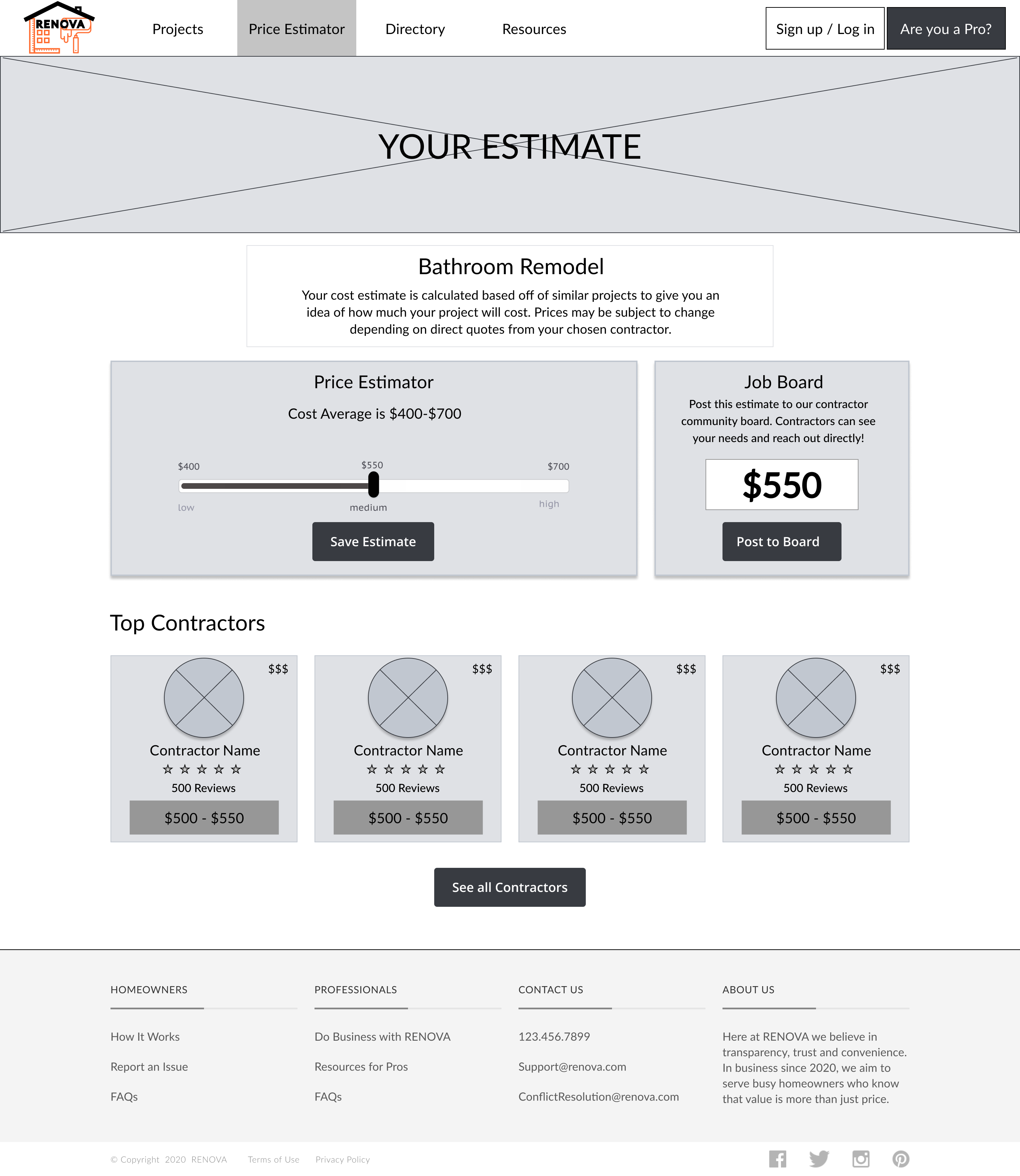
- Price estimator: user can get an estimate to determine affordability; further, users can post their estimate to a communal-style job board to broaden chances of appropriate matching with professionals.
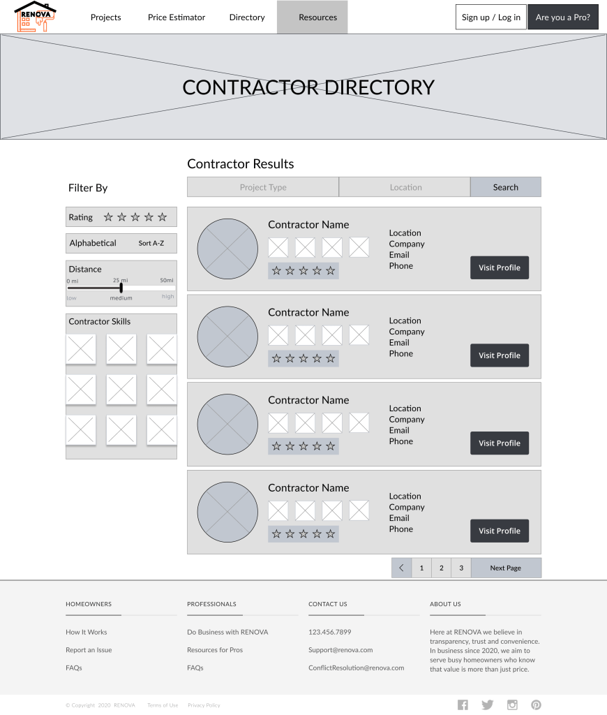
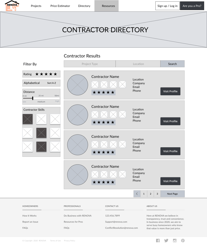
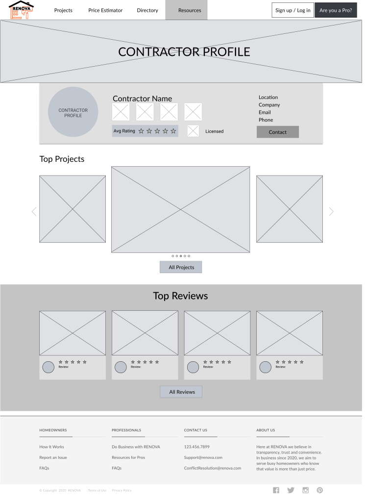
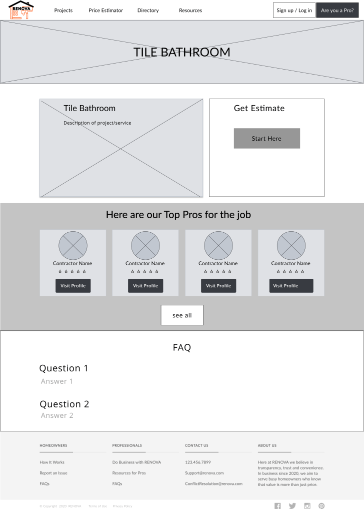
- Contractor directory & profile pages: user can vet contractors if they are intending to hire, including past projects, certifications, and reviews.
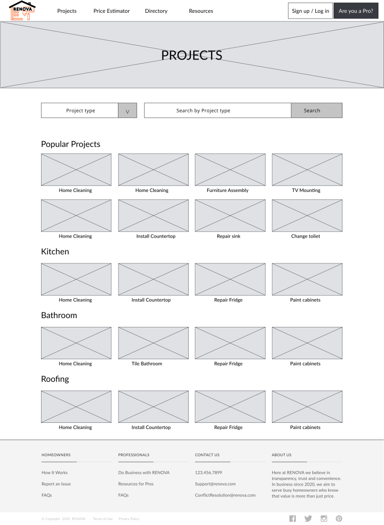
- Projects page: allows user to explore various projects without commitment.
Validation
To find problematic areas within the design, six participants** were asked to complete two key tasks within the platform during usability testing.
Findings

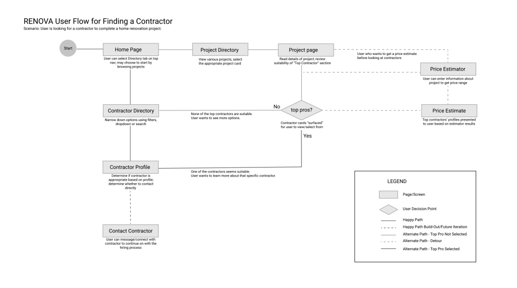
A majority of users did not follow the assumed “happy path.” While the intention was to have users go to a directory feature, half used the search bar first, while still others went another way. To better align with users’ mental models, the team created a user flow to better reflect behaviors noted during testing as well as guide iterations.
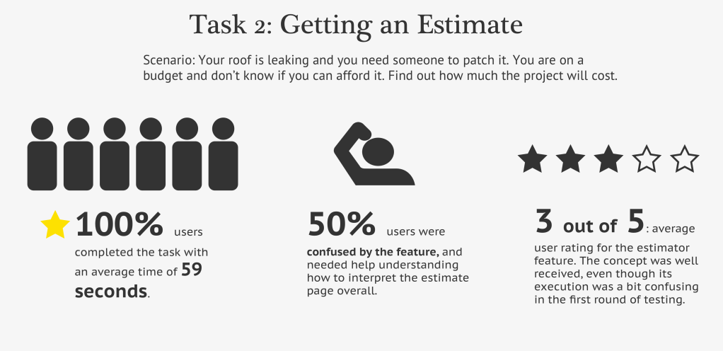
User feedback was invaluable to determine what iterations to focus on with the remaining time on the project. Specifically, more explanation of the slider and how to interpret the estimate’s results were necessary. Given this “twist” on standard price estimate features currently on the market, taking more time to guide the user through the design could have yielded better results and a better user experience.
From the results, the team circled back to make iterations and complete the project.
** Recruitment of participants was directly affected by COVID-19 and the need for social distancing. This round of testing focused on quantitative metrics and testing the functionality of the design itself. For these reasons, the team included two participants who did not meet target audience criteria and analyzed resulting data in consideration of such outliers.
Outcomes
Usability findings were a solid, actionable start in refining RENOVA’s design. The team was able to complete one last round of iterations before the end of the project. Prior to concluding the project, the team identified future recommendations for the next design team to pick up where we left off.
Iterations & Final Design
Price Estimator
- More visual information and copy to explain the feature’s benefits and how to use it.
- Clearer affordance of price to the right, which changes as the user interacts with the slider. Top contractor cards also change as the user moves the slider.
- Clear call to action for user to use the contractor job board feature.
Watch a movie of the price estimator feature at work here!

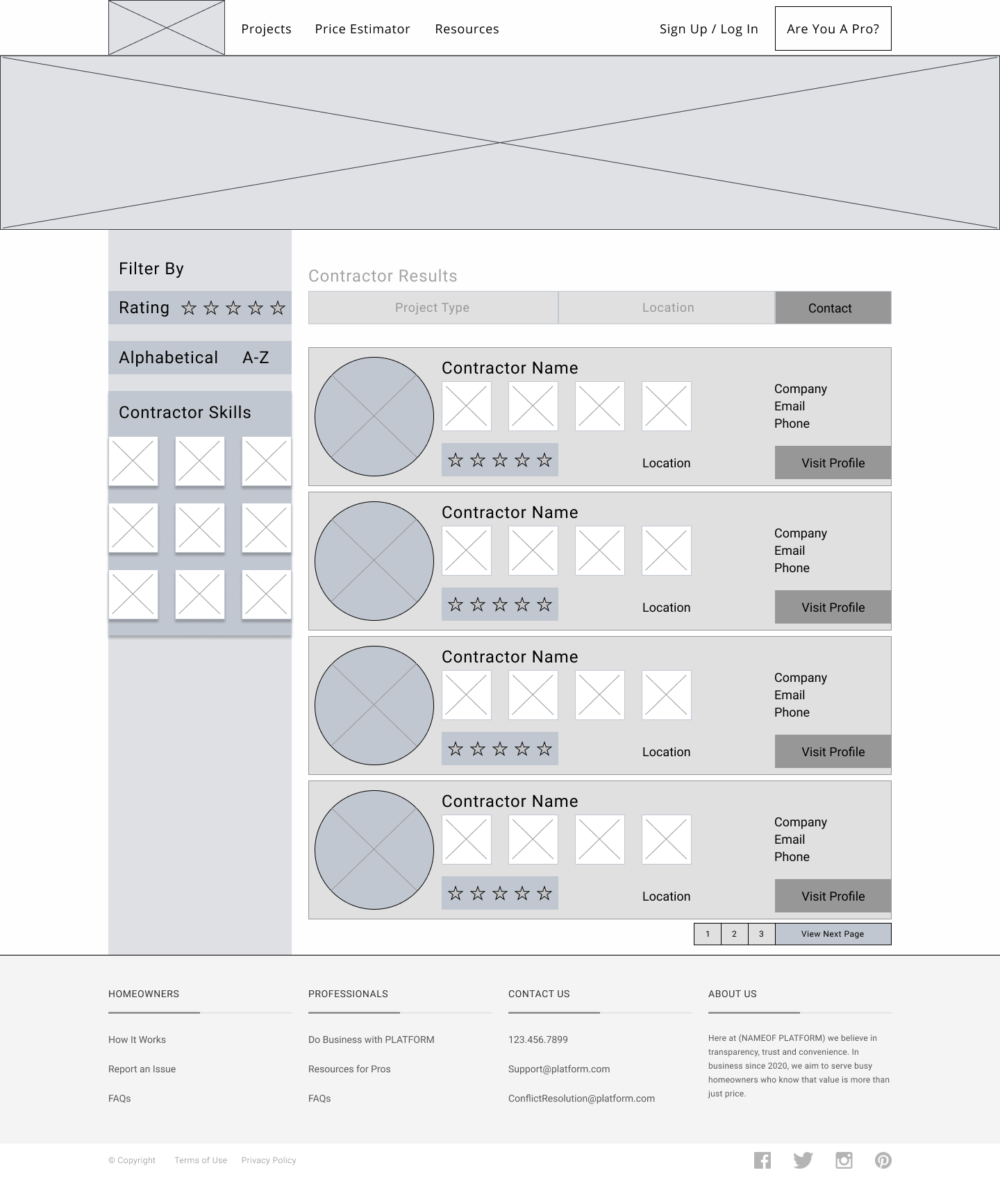
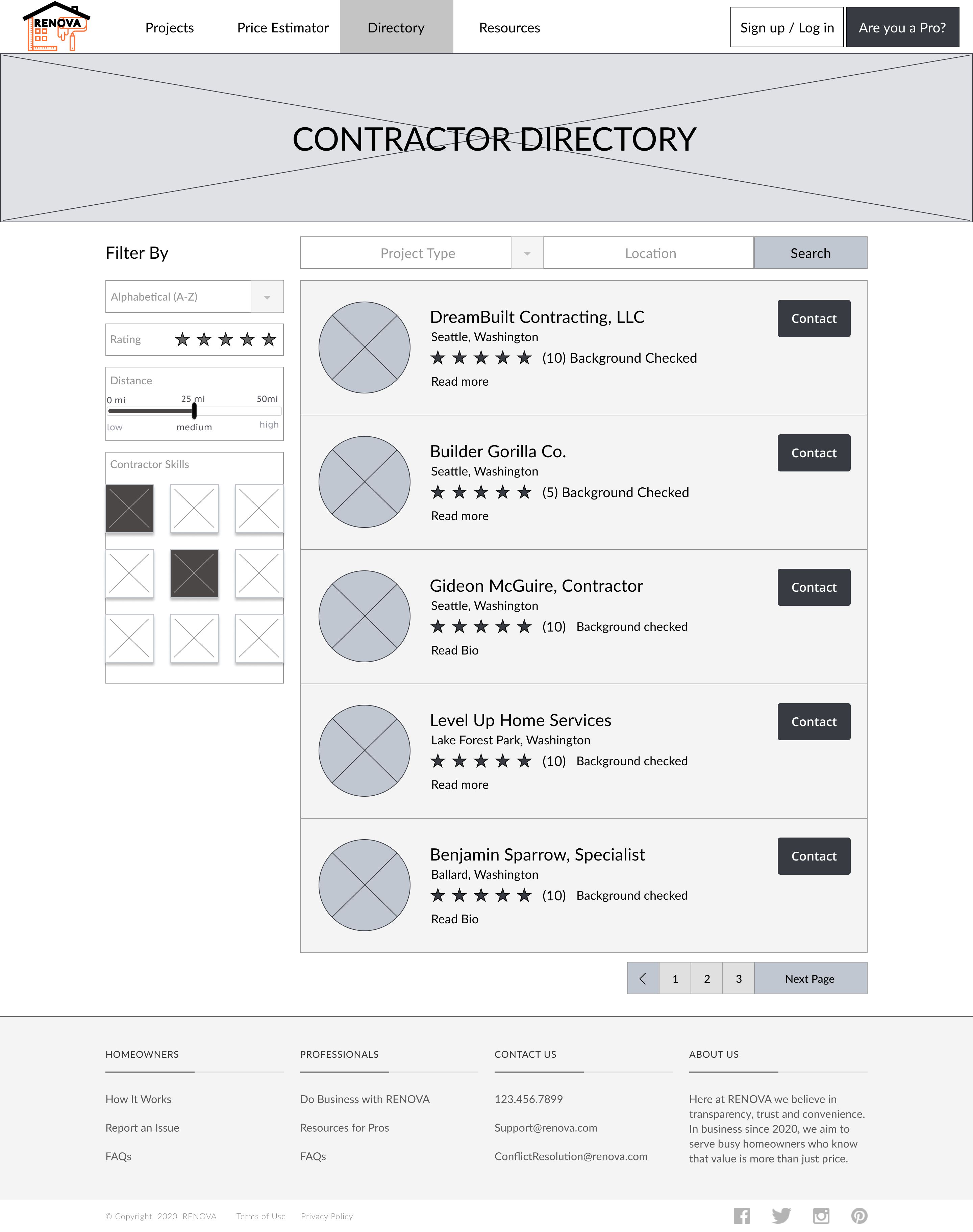
Contractor Directory
- Added top nav link to the directory to make it easier for users to get to.
- Cards were given a cleaner, more balanced aesthetic.
- Reconsidered filters and how they relate to user needs.
- Adjusted affordance of all page elements and added a call to action for users to contact professionals directly.
Check out a demo of the prototype here!
While the team did additional iterations to support and build upon the main flows seen here, there was not enough time to make all the changes we wanted. So, we determined the following future recommendations to continue building better user experiences with the RENOVA platform.
Future Recommendations
Expanding on Existing Concepts
Further development of the glossary, job board, and messaging features that were already considered during the length of the project could be a value add to the design.
Designing for Contractors
While the scope of work focused on the consumer half of the two-sided platform, beginning to incorporate designs to support the other half of users (contractors) would be beneficial to building a complete platform.
Referral Feature for Users
Research indicated that most users rely on personal recommendations when hiring. A referral could emulate this mode of communication, helping to increase customer acquisition and build brand trust.
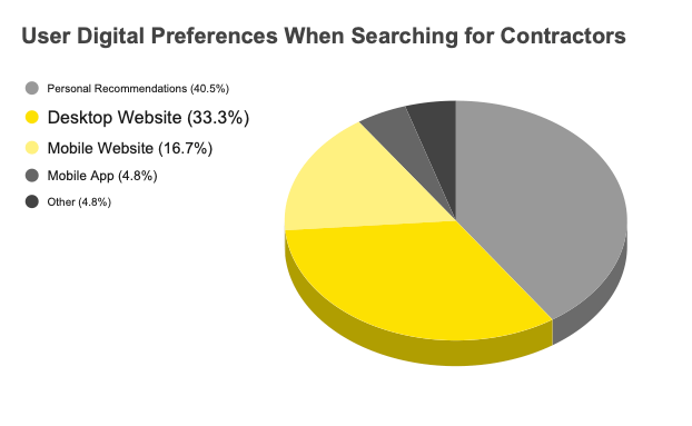
Accompanying Mobile Designs
While desktop was more preferred, mobile websites and apps accounted for 21.5% of users’ first digital contacts when hiring. A responsive mobile design could expand user engagement across devices.
