Overview
Revolution Agriculture creates Farmlet micro-containers that sit on privately hosted land. In return for volunteering a space roughly the size of a parking spot, hosts receive a percentage of the profits made from produce that is distributed from their Farmlet. We redesigned the website to convert more hosts.
With more hosts providing space for Farmlets, the startup could expand to selling produce yields to consumers, creating a localized food production network.

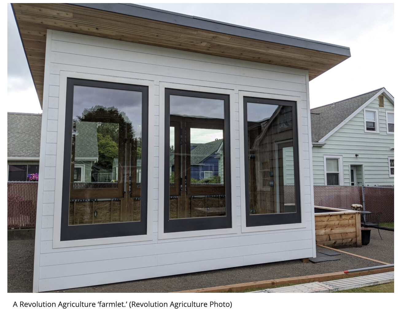


Photo Credits: Revolution Agriculture
Problem to Solve
Site visitors weren’t making the “jump” to being Farmlet hosts with the current design, so the goal was to uncover the barriers preventing conversion, both through connecting with consumers directly and considering the design itself. Determining what information users needed to make an affirmative decision was critical to addressing our stakeholders’ conversion rate concerns.
Target Users
- Residential Farmlet Hosts
- Commercial Farmlet Hosts
- Produce Purchasers/Consumers
- Investors
We focused on residential land owners to solve this problem.
Approach
Role
I took the lead in planning and implementing research efforts during the design process to keep users at the center of the design. I also focused on redesigning the sign up form to accommodate multiple types of users wanting to connect with the company even if they could not host a Farmlet.
Areas of Focus

Discovery research into potential hosts’ attitudes and motivations related to the Farmlet and signing up to host their land

Concept designs reordering information architecture and user flows to better align with users’ mental models and expectations

Concept feedback and usability testing to validate design choices prior to implementation
Process
Aligning with Stakeholder Goals
To begin addressing the goal of increasing conversion rates , the team needed to bridge the gap between website presentation and visitor reaction, illuminating visitor behaviors with user-centric thinking.
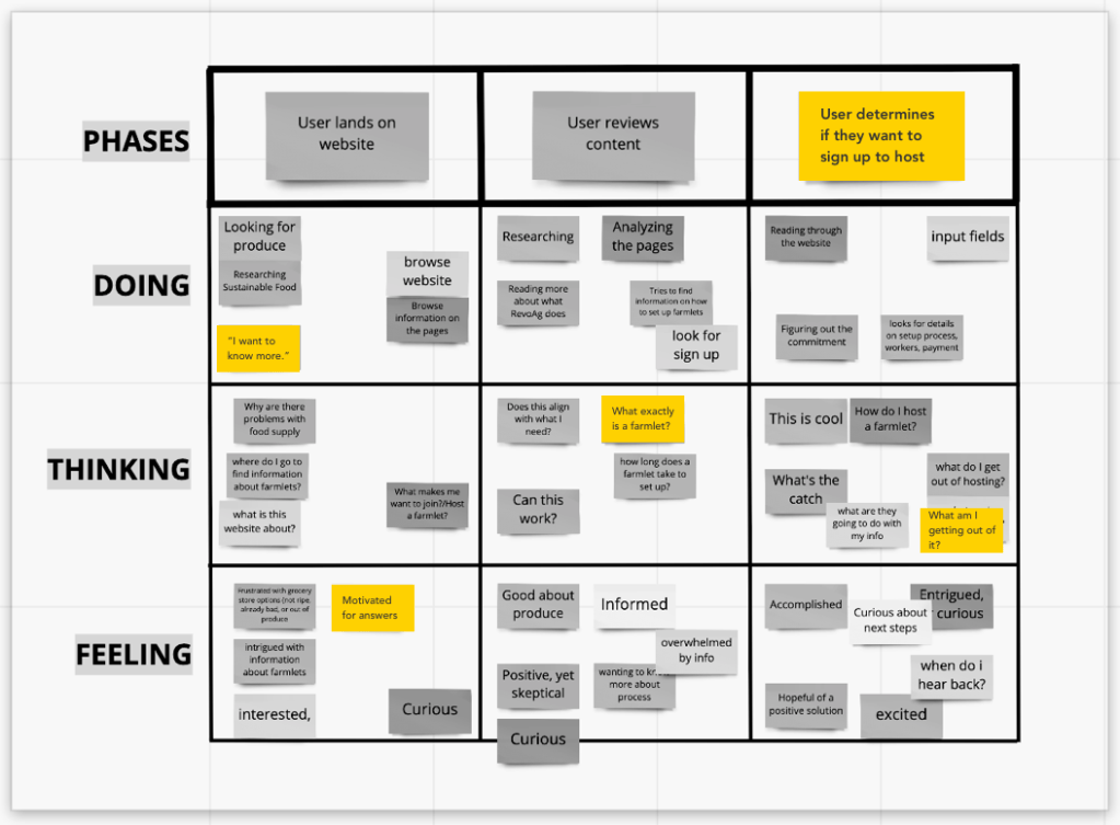
Scenario Map
The team workshopped a scenario map with the client to begin understanding how users might think and feel as they move toward hosting a Farmlet, as well as identify areas for exploration. This gave the team some beginning assumptions to validate with users themselves.
Exploratory Research for Empathy & Action
I began with an overall research plan to familiarize ourselves with the domain and consumers.
After conducting a content inventory and visual competitive analysis, the team set out to connect with users directly (albeit virtually) to determine pain points within the current design, as well as the types of information required to feel confident in signing up to host. General impressions of the current design were also recorded during this initial round of interviews.
Moderated User Interviews
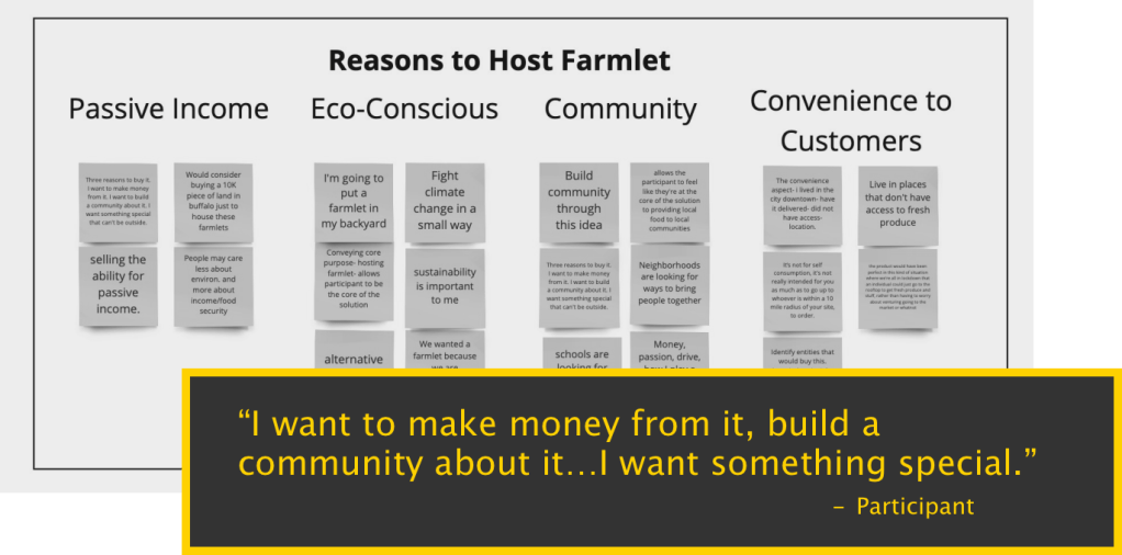
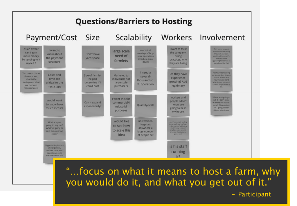
I gathered feedback from six users familiar with Revolution Agriculture and the hosting service. Interview questions explored:
- Intrinsic motivations to host
- Barriers or issues preventing ability/desire to host
- Informational needs to make affirmative decision
A user interview plan prior to interviewing detailed the interview questions and testing execution so that interviews could be consistent across team members working remotely.
Gaining & Responding to User Insights
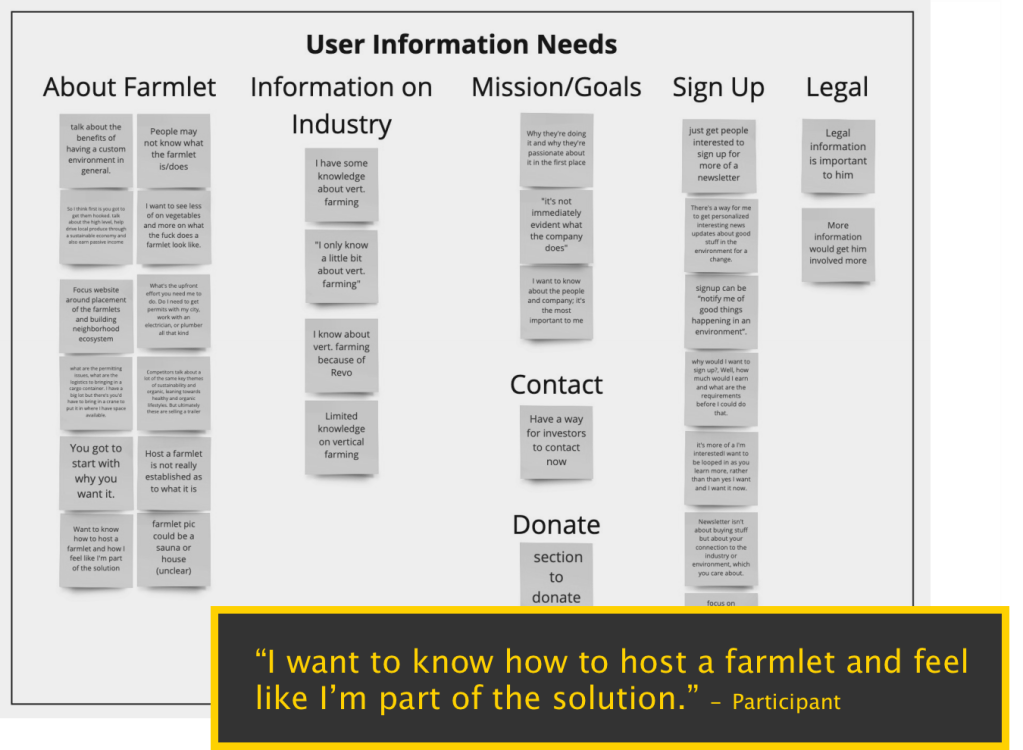
Synthesizing interview insights revealed some key points we could make actionable through redesign:
100% of users identified at least one barrier to sign up, with 33% identifying two or more.

Users pointed to a lack of relevant information – what they need to determine before signup – within the website design.
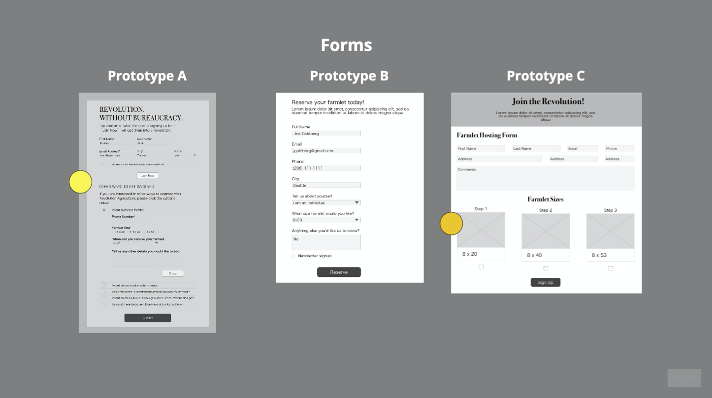
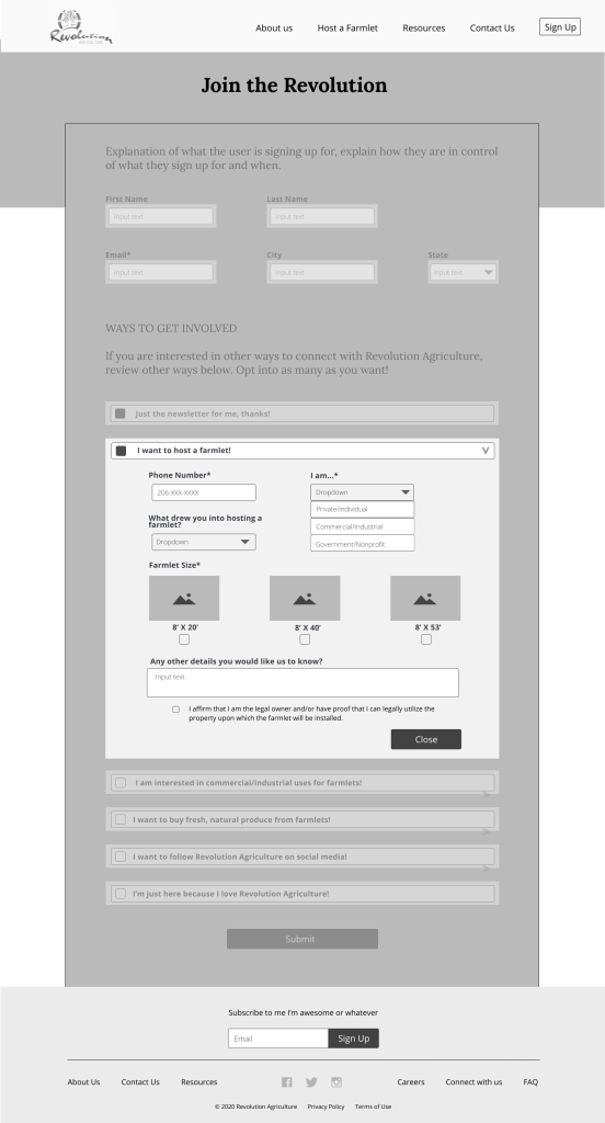
A “host-or-bust” form becomes exclusionary to a wide range of users who can still stay engaged in other ways.
The sign up form in its present state was a dead end for users. A form only for hosts excluded every other user type identified and there was no other was to sustain engagement once users left the website.
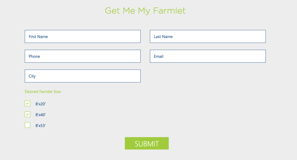
I envisioned a form that could account for all use cases while still being an easy process for each group. The reason I focused on this aspect was to future-proof for when Revolution Agriculture reached enough hosts to turn its attention to its other goals, such as selling produce. The form could be used to warm up the market and connect with users who could potentially be hosts over time.
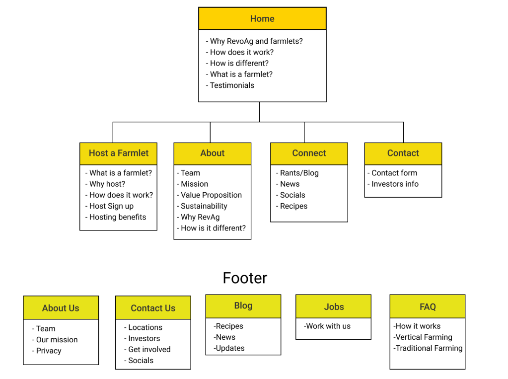
The team collaborated on restructuring information architecture so that content would better align with users’ mental models and needs. I additionally focused on the sign up form itself to accommodate multiple use cases (not just hosting) so users that may potentially want to host later are already connected with the brand.
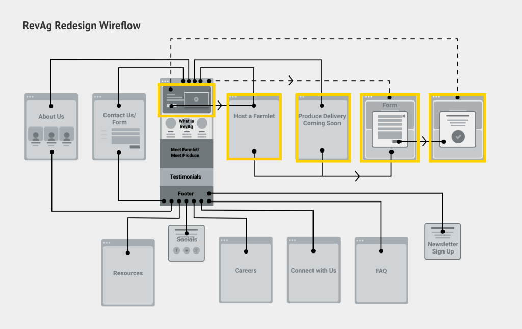
Early Concepts & Testing With Users
Setting the information architecture prior to creating conceptual wireframes allowed the team to work with a consistent baseline during ideation. Each team member created a concept to test through a second round of user interviews.
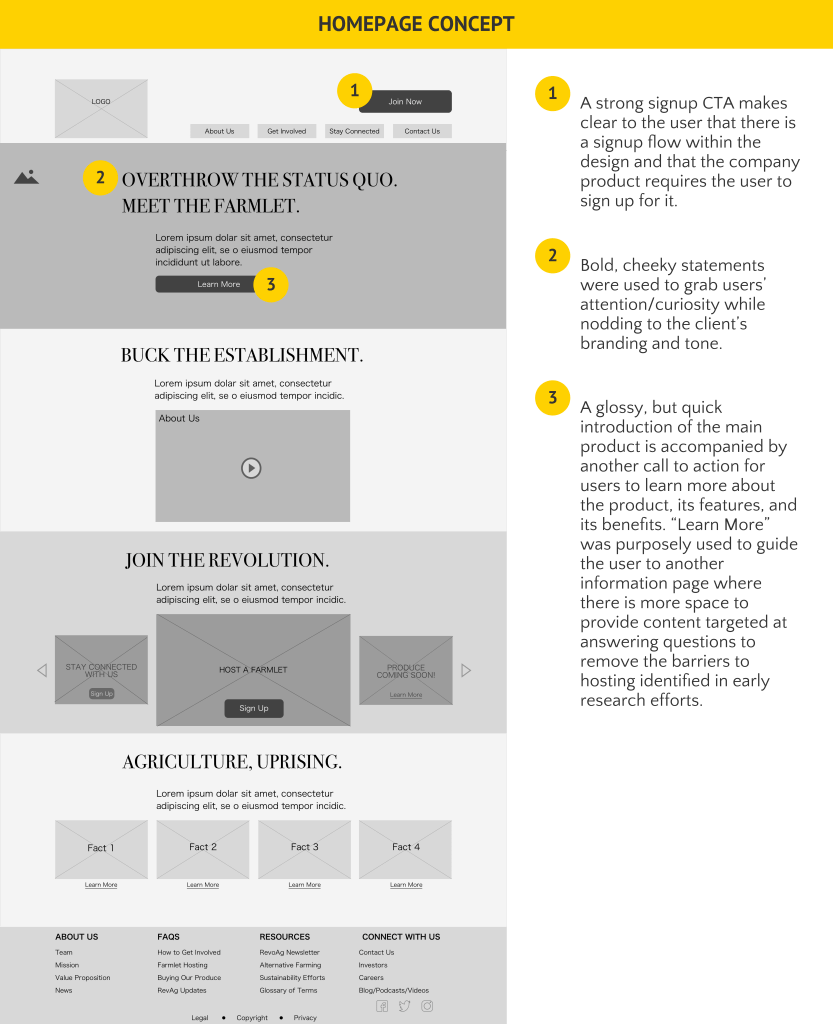
My concept focused on:
- Bold, attention-grabbing statements to match the tone of the brand
- Call to action for users to learn more before asking them to sign up to host
- Multiple calls to action on a more detailed information page to see where users start moving toward conversion
- A multi-point sign up form to capture all use cases, not just hosts


The sign up form concept focused on:
- First signing up for a newsletter/communication from the company.
- Can apply to all user types
- Helps build brand awareness which could potentially lead to future hosting conversions
- Users already determined to sign up can complete that process without navigating away from the form
- Accounts for multiple user types
- Accounts for users who want to be involved in more than one way
- Offers a way to communicate updates or future steps, especially around areas of the business that are not fully developed yet
- Can provide data to inform future business directions
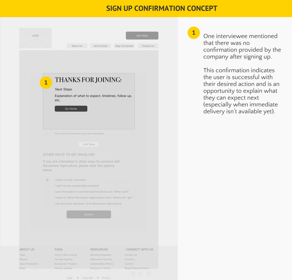
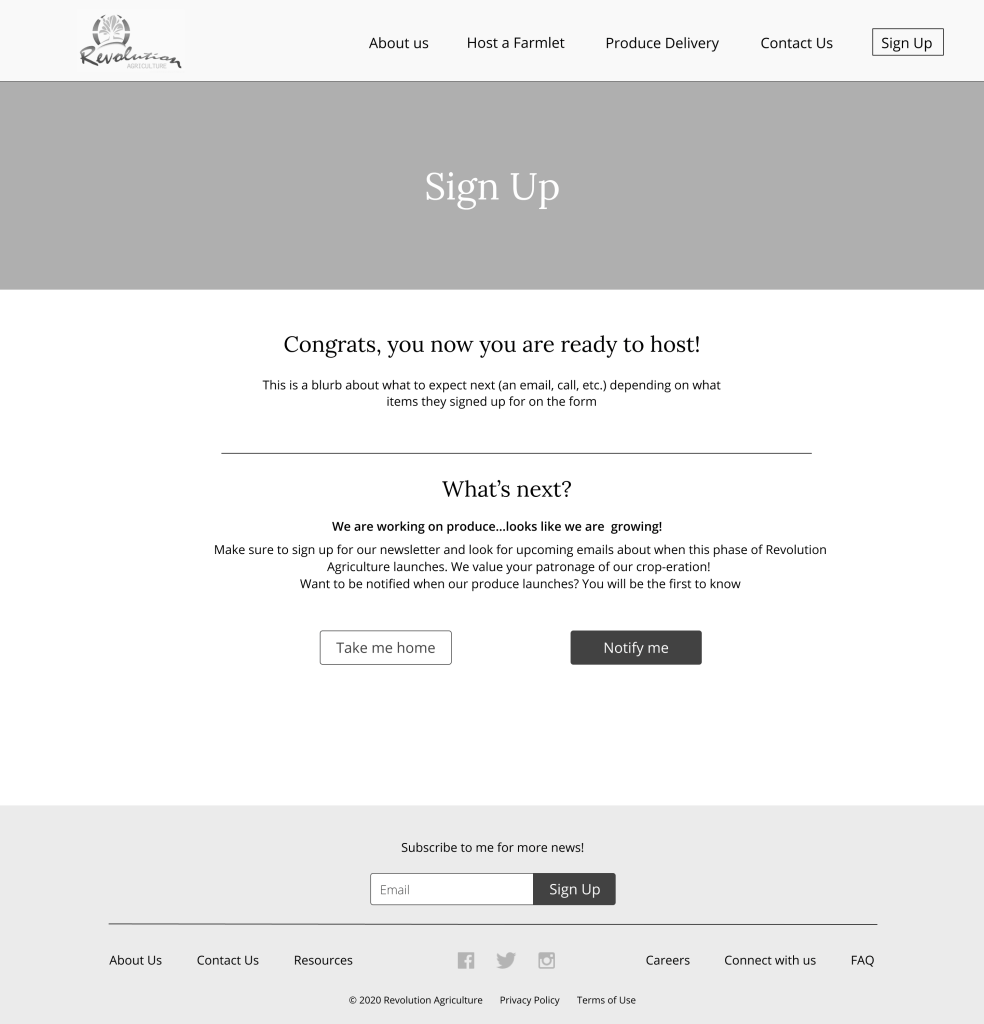
- Research revealed that there was no sign up confirmation provided to hosts. To combat another dead end, a confirmation modal was included in the concept design.
Concept Testing
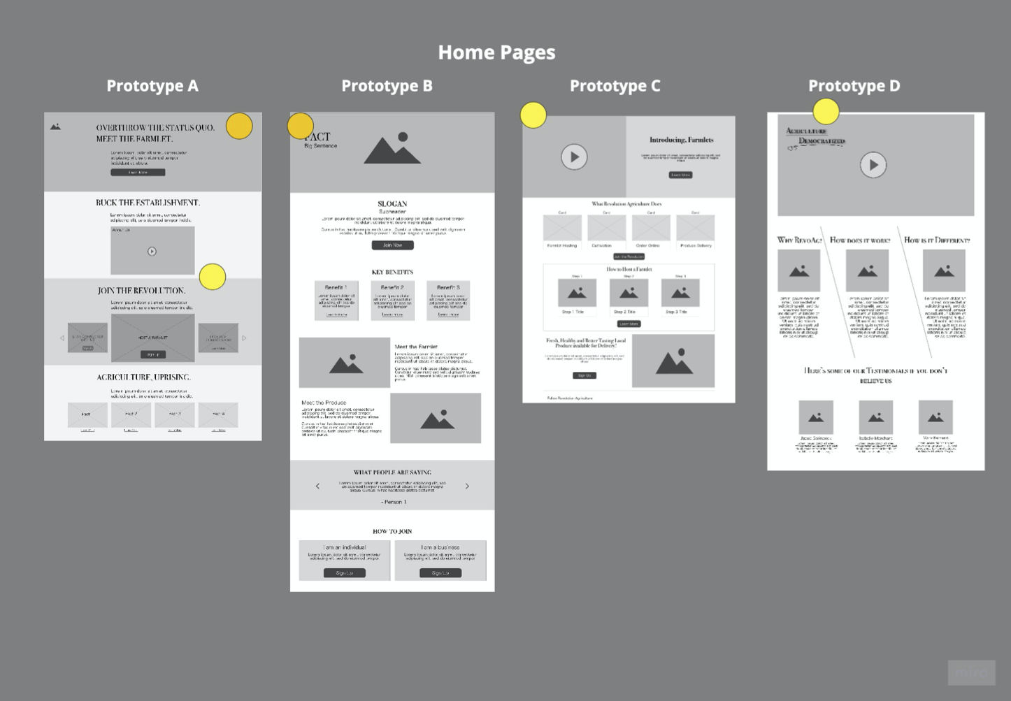
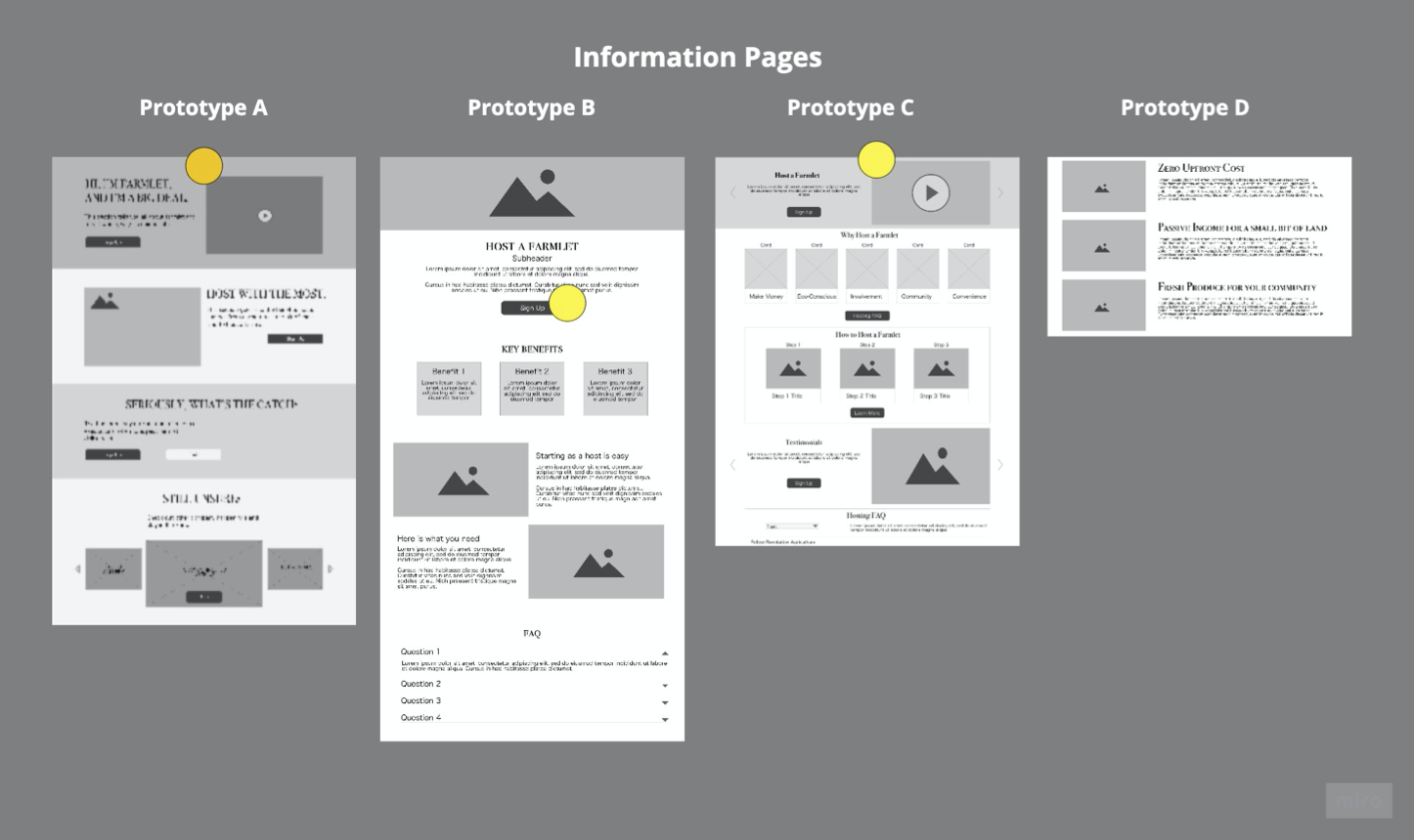
Lo-fi wireframes from each team member were made into basic prototypes to test with users. A total of four prototypes were presented to users for feedback (here’s mine!). The prototypes’ presentation was randomized for each session to minimize order bias in responses.
After synthesizing insights with affinity diagramming, the team prioritized changes with a rose-bud-thorn reflection exercise. An example of the exercise using my concept, Prototype A:
Rose
- Sign up process appeared straightforward; “…everything I would expect to see on a sign up process” – Participant
Bud
- The form itself needs more clarity on what users are exactly signing up for (may be resolved once taken to higher fidelity)
Thorn
- Too many call-to-action buttons prior to signing up confused users as to what they were signing up for
The team reviewed user feedback results with the stakeholder. To ensure the design’s alignment with Revolution Agriculture’s current assets and platform abilities, the team workshopped a dot voting exercise prior to converging into one comprehensive design.
Concept testing was helpful in guiding design iterations while converging multiple lo-fidelity concepts into a cohesive mid-fidelity design.
Converging Design & Usability Testing
The elements from my concept that contributed to the converged design were:
- Using video to explain the Farmlet and how hosting works (although all concepts explored this approach)
- Inviting users to “learn more” (homepage CTA) before asking them to sign up immediately
- Expanding the sign up form to include more users than just hosts

Usability Testing
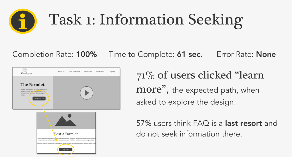
Usability testing focused on the relevant tasks of finding out more information about the Farmlet as well as completing a full sign up process within the design. To validate both the design solutions and functionality, seven users were recruited using convenience sampling methods due to quarantine restrictions in light of Covid-19. Despite the challenges, the team was confident in the findings because approximately 85% of functionality issues can be identified by five users, with diminishing returns as sample numbers increase (read more here).
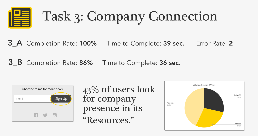
Sessions lasted approximately 30 minutes, covering four tasks**:
- Show us how you would find more information about the Farmlet.
- Order the smallest size Farmlet available.
- Connect with the company:
- Sign up for newsletter
- See latest news posts about company

**An additional task run during testing was excluded from discussion here because it did not drive iterative changes. Full details on planning and analyzing can be found here in the usability test report.
Some key takeaways from usability testing included:
Users spent around one minute assessing information before sign up, indicating that elevating user-centric content could help the decision making process.

43% of users found the form difficult, spending over five minutes on sign up. Streamlining and simplifying form fields would be a major focus during iterations.
Users relate to company content labels in flexible ways. Users associated news and newsletters with “resources” instead of “about us.”
Participant 5 stated it best, “It’s on the right track, but there’s room for improvement.”
Outcomes
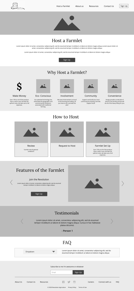
Final Design
Another round of iterations was performed to incorporate usability testing results. Users reported that the form was confusing, so a multi-step form design replaced the original concept. While I was not in favor of submitting such a drastic design change to the client without doing some research on it with users, the team decided it was the best direction to go in with the remaining time we had for the project. Unfortunately, the multi-step form design reverted to focusing solely on hosts instead of Revolution Agriculture’s broader audience.
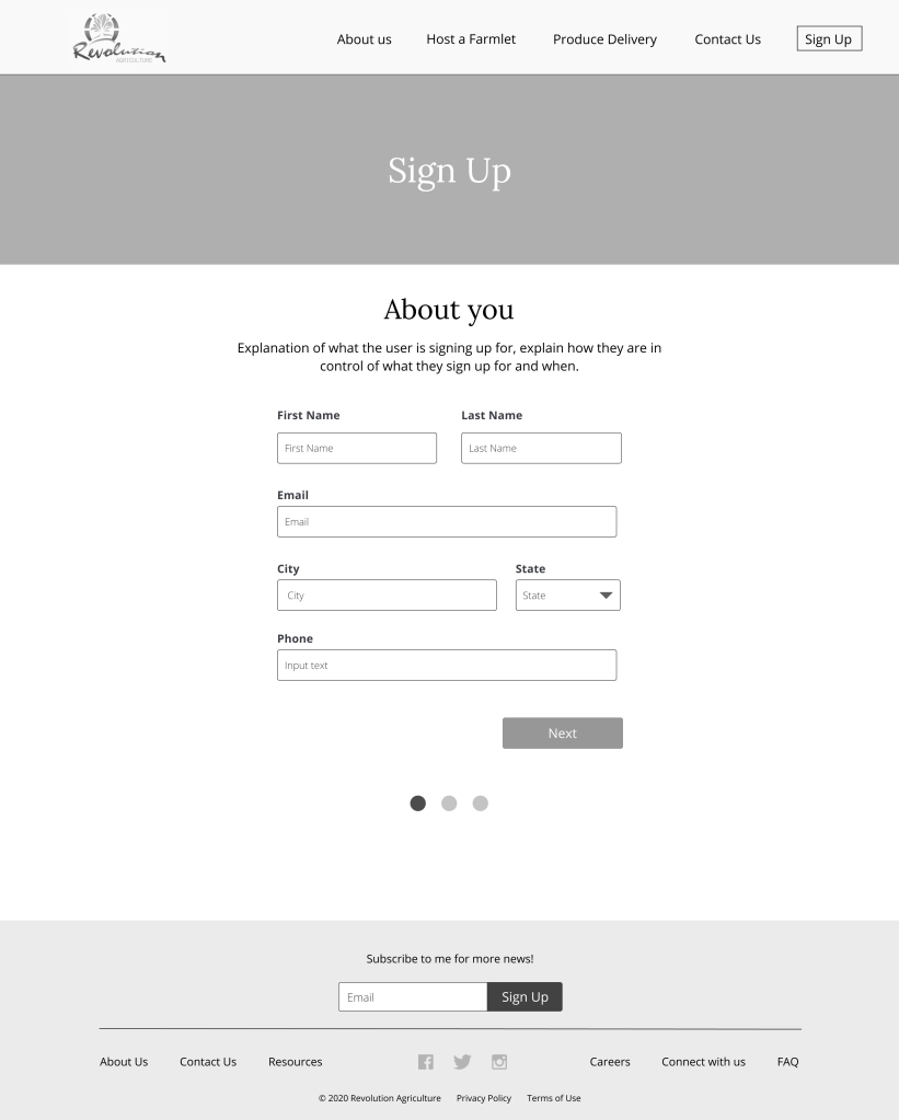

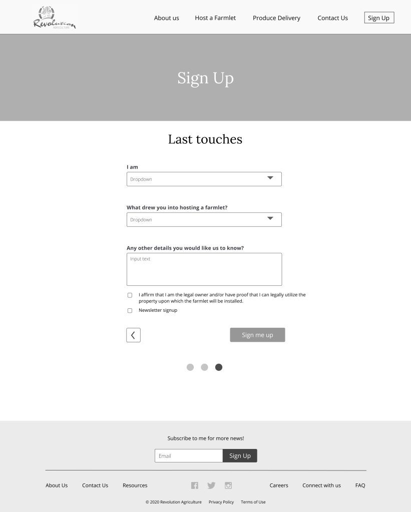

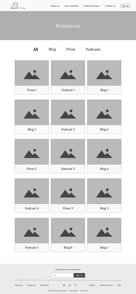
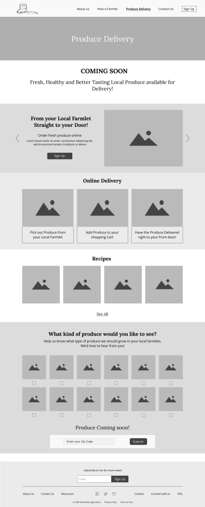
Additional pages were built for the final design to give the client a more complete view of the architecture. Resources, About Us, and Produce (Coming Soon) pages were added to the design but were not included in usability testing.
I came up with the idea of adding a feedback “quiz” on the produce page as a way to engage users, get them excited about the product (even though it hadn’t launched), and collect data for the business to use when planning for the produce/growing phase of their operation.

Lessons Learned
- Challenging assumptions can lead to opportunities for solutions: At the outset, the client had a lot of assumptions about his users built into the website design. Challenging those assumptions through research was a way to find solutions.
- Prioritizing iterative work is trickier when feedback is varied: Trends and patterns were not as strong in concept testing compared to other methods. With more grey area, the team struggled a bit with deciding which changes to make within the time we had. Pro tip: whip out dot voting MUCH earlier when this happens!
While the client has not implemented any design changes as of the writing of this case study, I am forever thankful for the opportunity to work on such an interesting product and help the Farmlet grow its fanbase!
